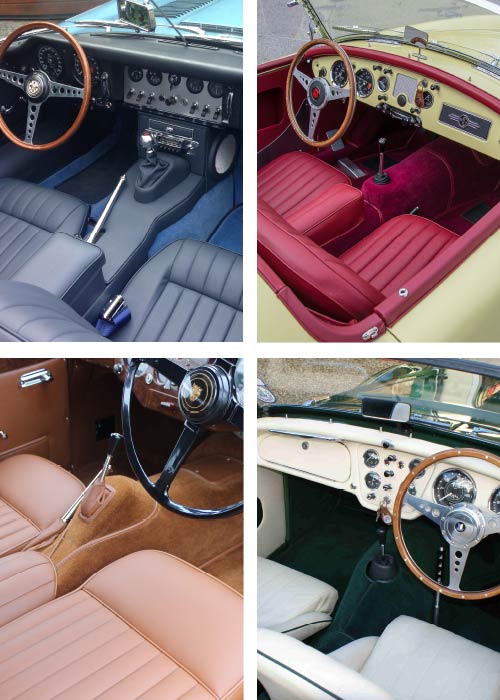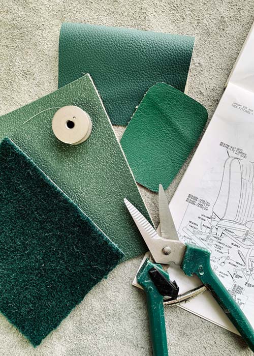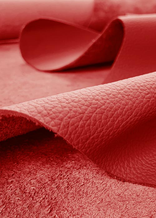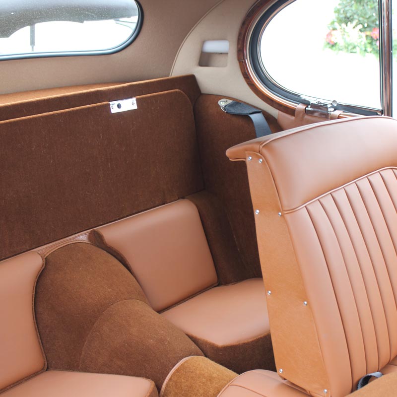
We never guarantee a full colour match between our Primary and Secondary materials – nor would we want to – and here’s why.
Colour is a complex thing. Scientific yet subjective, colours can divide opinion and are open to endless interpretation. Here, we take a closer look at colour matching and the most important things to consider when looking at samples and swatches.
We feel your frustration – when the Suede Green Hardura doesn’t quite match the Suede Green vinyl… or the Red Moquette looks a little too bright against the Matador Red leather…
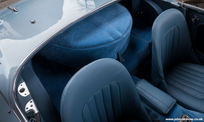
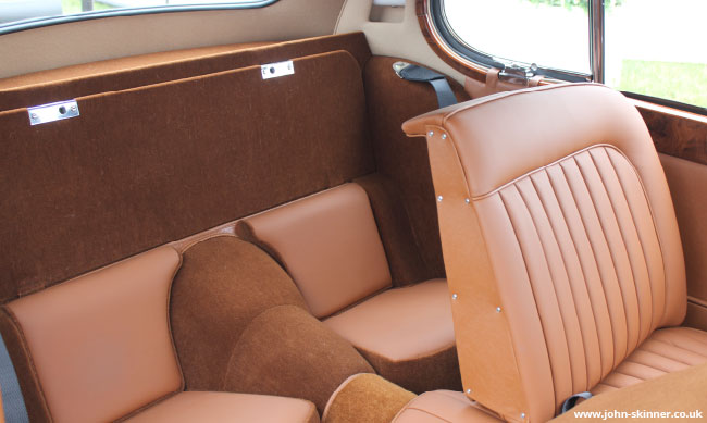
But over the years, we’ve come to accept these subtle colour shade differences as something really quite beautiful that should be celebrated within a classic car interior.
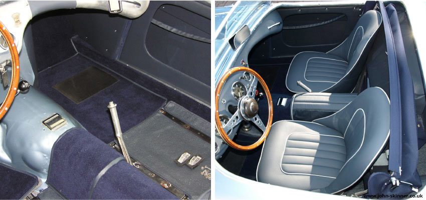
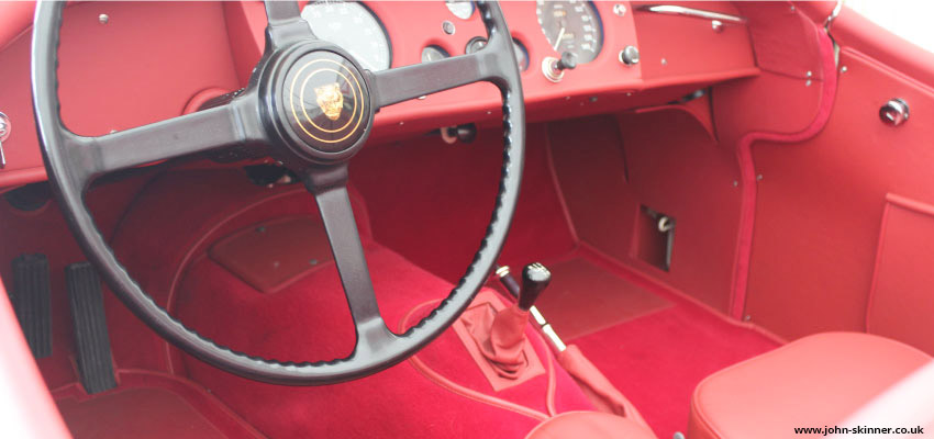
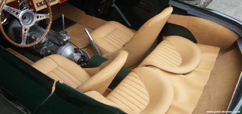
We have been asked many times if we can improve the colour matching between our materials, and it’s simply not possible. To help explain, we have outlined below the 5 key points to take into consideration when looking at colour, and most importantly, we share some inspiring interior images from customers who have embraced colour shade differences to create beautiful interior schemes.
1. Different materials and fibres uptake colour differently
All of our materials originate from different fibres and manufacturing processes – it’s what gives them the qualities that make them fit for purpose.
Within an interior, many materials and textures are working together at the same time; leather and vinyl for seats and panels, carpet and hardura for flooring, furflex for door edge trims and moquette for seat backs – each material is there for a reason. Their different textures and surfaces means that they all respond differently in dyeing and as a result, their uptake of colour varies between them.
For this reason, we never guarantee an exact colour match across all of our materials, but we do embrace the subtle differences in tone and appreciate that they work together to create a beautiful scheme with high and lows of colour depth and appearance.
2. Consider light
Light has a profound effect on colour. Colours viewed under natural light can change throughout the day according to light levels, whilst artificial lighting can significantly alter a colour shade completely. Bear this in mind when you are looking at swatch cuttings and view them under a variety of light sources to help best understand the colour.
If you are trying to colour match an old interior, it is also worth remembering that sunlight may have caused significant colour fading. In this instance, it is always best to go by the colour information detailed on the Heritage Certificate rather than sending us swatches of the original interior for colour matching. We will advise the correct colour based on our knowledge of originality.
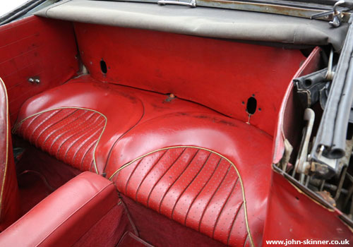
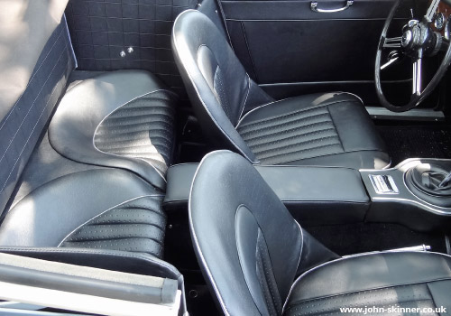
An example of sunlight causing a significant colour change is on the Austin Healey 3000 Mark 3 BJ8 that featured chrome piping to the front and rear seats. Exposure to sunlight caused the original chrome piping to turn a golden colour – and we are often asked if we can supply our restoration seat kits with the ‘original’ gold piping. We always advise our customers that ‘gold’ piping is the result of colour damage by sunlight, and we only supply the seat kits with the correct chrome piping that would have been used on original factory production lines. We are one of the only interior trim suppliers to use the original specification chrome piping to these seats – you can see this piping in more detail here.
3. Never try to match a sample from a printed image or digital screen
We are often asked if we can identify and match a colour from an image seen in a book, magazine or online. This is extremely difficult as this process is very open to interpretation and colour output can be affected by printer and screen calibration, in addition to camera flash settings and light levels when the photograph was originally taken. Whilst it can be useful to share research images with us for an idea of the colour you are looking for, we can only advise our closest matching shades based on our existing library.
Our comprehensive online Material and Colour Library details all the materials and colours we offer, although we always recommend you contact us for samples before final colour confirmation as colours viewed on screen can be mis-leading and inaccurate.
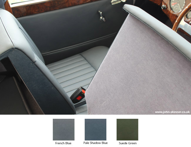
4. Think of the colour scheme as a whole
We offer a free worldwide sample service for all our materials and colours and our customers find this incredibly useful for building their interior colour schemes.
We appreciate it takes some vision, but when you receive the samples from us, try to visualise them as a whole colour scheme rather than as individual swatch cuttings. We have carefully built our material library to offer a comprehensive choice of colour, and whilst some materials may not be an exact colour match for others, the key point is that they tone well together once in position within the car. Secondary materials such as Moquette or Furflex (which may not colour match on a swatch card) can help seamlessly blend leather/vinyl items with carpet items as they provide a tonal colour bridge between the two different materials.
5. Batch variations
‘Batches’ refer to production runs where a supplier will produce an allocated quantity of material before finishing and starting a production run of another material. Stopping and starting production processes can lead to small variations in colour between production runs, but these will be subject to approval within certain ‘tolerances’ per colour, per run. These tolerances allow for a slight variations in colour between batches, but anything significantly different will be rejected. Allowing for colour tolerances reduces wastage, as suppliers look at what can be realistically accepted for a colour rather than trying to achieve an exact colour each time.
We have established relationships with all our material suppliers who carefully oversee batch production which means we can order our raw materials in confidence that they will arrive on-site true to colour.
All of our materials & colours can be subject to batch shade variations. Although minimal in most cases, to help avoid this, we always recommend purchasing similar material interior trim items at the same time so that they are made from the same batch in our workshop.
If you are purchasing leather hides, or material by the metre for use across a project, we also recommend you order the entire quantity of material you need at the same time so that we can ensure batch colour consistency.
- Categories: Colours and Materials


